
The Beauty of Google Illustrations Explained
Analyzing The Magic Behind Google's Illustration Projects

Hello, fellow designers! Google illustrations are truly a beauty, and there is no doubt about it. Most illustrations I've encountered as empty states or content-supporting elements are well-structured, color-coordinated, and have a story woven into the metaphors they depict.
While these qualities are critical to every product-based illustration, they are not the sole reasons behind their magic. There are additional elements we can learn from. To explore this further, I have compiled five of the most creative Google illustration projects found on Behance. Please visit these projects via their respective links to appreciate the designers' creations.
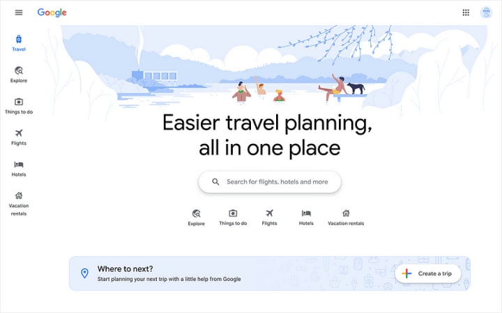
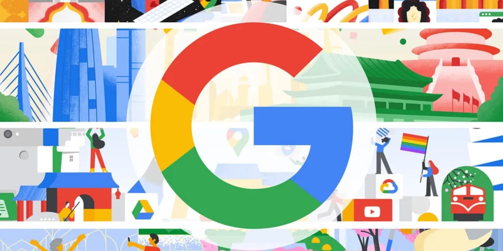
Google Travel
This project brings to life all the travel verticals that Google offers. The illustrations serve as a primary enhancement for the headers, making them visually engaging while also helping to unify the website's brand identity. They achieve this by employing consistent color schemes and carefully curated illustrative elements that align with Google's overall aesthetic and values.
Work by German Kopytkov
The Google Travel website's illustrations are presented in expansive wide landscapes, creating an inviting visual experience. Through the thoughtful combination of vibrant colors and charming shapes, the designers effectively differentiate the background and foreground.
This distinction enhances depth perception, making the illustrations feel dynamic and layered. Furthermore, by leveraging the strategic use of simple yet deliberate color palettes and varying object sizes, the proximity of elements on the canvas is communicated to the viewer. This ensures that every detail serves a functional and aesthetic purpose.
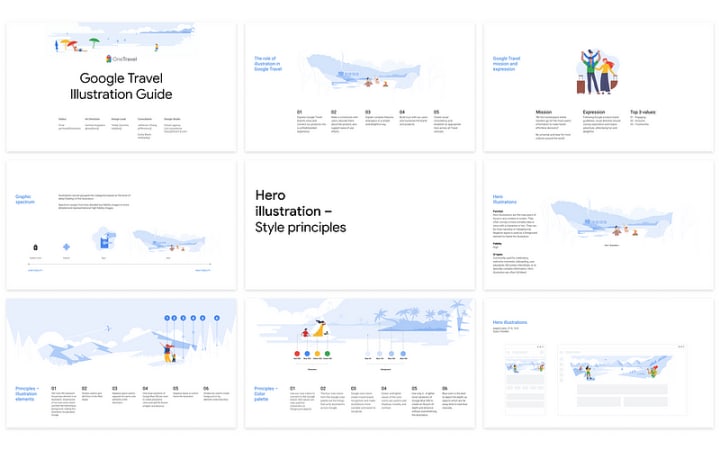
Responsiveness
One of the standout features of these illustrations is their impressive responsiveness. Designed as full-width visuals, the positions and sizes of background and foreground elements dynamically adjust based on the viewer's device.
The illustrations maintain their visual integrity whether displayed on a large desktop screen or a compact mobile device. The design prioritizes key elements by giving them higher prominence on mobile displays, ensuring the essential components remain visible and impactful. This adaptability showcases the designers' attention to accessibility and usability across platforms.
Compatibility with Dark Mode
Users prefer Dark Mode to reduce eye strain, especially in low-light environments, illustrations must adapt seamlessly. Google Travel's illustrations showcase a perfect balance of aesthetic appeal and functionality.
The supporting elements in these illustrations are designed to harmoniously adjust their colors, ensuring they complement different UI modes. Integrating subtle yet effective changes keeps these visuals vibrant and clear even in Dark Mode b. It's worth noting that few products go to such great lengths to ensure their illustrations are compatible with both light and dark interfaces, making this a standout feature.

Google The Update
This series of 20 videos featuring Google leaders and industry experts as spokespersons is designed to convey key insights and updates. Each video is enhanced by short, looped animations that seamlessly align with the narrative, providing a dynamic visual supplement to the spoken content.
The animations not only serve as engaging visual aids but also play a crucial role in reinforcing the key messages of the videos. Combining smooth transitions and carefully coordinated motion, these loops capture the viewer's attention and create a more memorable viewing experience. The interplay between visual and spoken elements ensures that the audience remains fully engaged, making this series an exemplary model of how animations can enhance storytelling and communication.
Work by Champ Panupong Techawongthawon
Simplistic Motion
This project exemplifies the art of simplicity in animation. Employing clean, minimalistic vectors and a single-color palette, breaking away from the vibrant, multi-colored style commonly seen in Google projects. This restrained aesthetic choice creates a unique visual identity and ensures the animations are clear, focused, and purpose-driven.
Infinite Animation Loops
One of the standout features of this project is its mastery over infinite animation loops. Each loop is meticulously designed to narrate a distinct story using only basic shapes and forms. This approach highlights how simplicity, when paired with creative execution, can convey powerful narratives. Smoothing transitions and the perpetual motion of the loops captivate viewers without overwhelming them, demonstrating an elegant balance between form and function.
Narrative Simplicity
Despite its minimalist approach, the animations manage to tell compelling stories. Each sequence uses straightforward visual elements to craft engaging narratives, proving that effective storytelling doesn't always require complexity. The focus on clarity and intent ensures the animations communicate their message efficiently, resonating with a wide audience.
Impactful Design Choices
The project's use of minimalism serves as a lesson in impactful design. By stripping away unnecessary details, it underscores the importance of purpose-driven visuals. This method allows viewers to focus on the essence of the narrative while appreciating the beauty of well-executed simplicity. It is a testament to the power of minimalistic design in delivering visually appealing and functionally effective results.
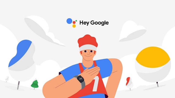
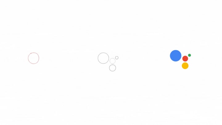
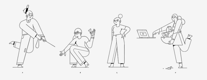
Google Assistant
This mobile-first project was carefully crafted to introduce Google Assistant's new app integration in a highly engaging way. Adopting an Instagram-inspired approach, the project leverages familiar, user-friendly design patterns that resonate with a broad audience. It incorporates a sophisticated level of 2D shape morphing, allowing elements to transition seamlessly and maintain a dynamic visual flow.
These animations are enhanced by Google's iconic color palette, which ensures brand consistency and adds a vibrant and approachable aesthetic. Combining elements creates a compelling and immersive user experience, highlighting the innovative potential of Google Assistant's integration while maintaining a visually cohesive and captivating presentation.
Work by Niceshit Studio & AGGRESSIVE
Negative Space
This project effectively uses negative space to balance animated character movements with background elements. Despite the complexity, the design skillfully integrates inanimate objects into the background to support the narrative. The objects adhere to Google's color palette, while their shadows use muted tones to maintain visual harmony.
2D Morphing
The animations employ mesmerizing 2D shape morphing to transform the Google Assistant logo into trees, houses, or furniture. This technique creates a delightful visual experience that enhances the narrative.
Mobile-First Approach
Given that many users in developing countries access the internet primarily through mobile devices, this project's mobile-first approach is noteworthy. The designers focused on storyboarding and carefully sketching frames within the mobile canvas to communicate the storyline effectively.
Character Design & Styling
The illustration style - characterized by curved forms - exudes a cute and lovable aura. The size of character faces is adjusted dynamically: smaller faces highlight body movement, while larger faces emphasize expressions. The effortless morphing of shapes supports motion and storyline, demonstrating impactful visual storytelling.
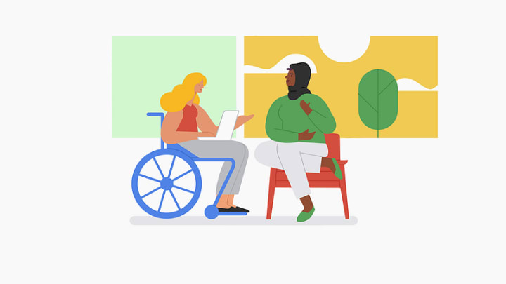
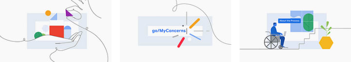
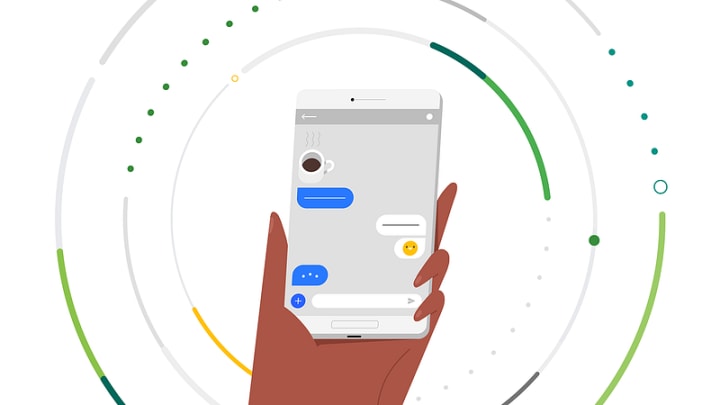
Google My Concerns
This project focuses on enhancing communication channels between employees, management, and HR teams to address lingering concerns. Fostering an open and supportive communication environment, the project emphasizes building trust and ensuring employee voices are heard and valued. It aims to create a more transparent organizational culture where individuals feel empowered to share their thoughts and feedback without hesitation.
Work by Brian Gossett
Continuity & Consistency
This project is particularly notable for its seamless and thoughtful use of motion. The animations center around a continuous hand-drawn line that artfully connects various shapes, people, and messages, symbolizing unity and collaboration. This simple yet impactful approach conveys a clear and positive narrative, reinforcing the idea of connection and support within the workplace.
Additionally, the project uses a cohesive color palette that perfectly aligns with Google's branding. The consistent use of colors enhances the visual appeal and ensures the design remains recognizable and integrated with Google's broader identity. The fluid transitions and harmonious design elements make the animations engaging and effective in delivering their message. Combining artistic simplicity with strategic design choices, the project sets a benchmark for creating impactful communication tools.
Emotional Resonance
Beyond its visual cohesion, the project also taps into the emotional aspect of workplace relationships. Soft, flowing lines and warm colors, the animations evoke feelings of trust, camaraderie, and support. These elements are carefully curated to create a sense of belonging, making the communication feel more personal and heartfelt.
Layered Storytelling
The animations go beyond surface-level design by incorporating layered storytelling. Each visual element, from the connected lines to the subtle motion effects, serves a dual purpose: to enhance the narrative and to guide viewers through the message seamlessly. This layered approach ensures the design engages audiences on multiple levels, offering immediate visual appeal and deeper narrative meaning.
Scalability Across Platforms
The project also stands out for its adaptability to various platforms and mediums. The animations retain clarity and impact, whether viewed on a high-resolution desktop screen or a smaller mobile device. This scalability ensures the design reaches diverse audiences, reinforcing the universal message of connection and support.
Integration with Branding
A final highlight is how seamlessly the animations integrate with Google's overall branding. The hand-drawn style and carefully selected color palette align with Google's aesthetic and enhance its identity by adding a human and approachable touch. This integration elevates the design from being visually appealing to being a key component of Google's communication strategy.
Google Privacy
This project highlights the importance of privacy tools and services within Google's suite. As online privacy is increasingly under scrutiny, this project emphasizes Google's commitment to providing secure, transparent, and user-friendly privacy solutions. Through thoughtful design and clear communication, it seeks to educate users on how these tools work while reinforcing trust in the brand.
Work by Loris F. Alessandria
Particle Motion
This motion project masterfully employs particle animation to draw attention to central objects, creating a visually captivating experience. The particles serve a dual purpose: they fill the screen, adding richness and texture while subtly guiding the viewer's eye toward the main subject. This careful orchestration ensures that the central message remains clear and compelling.
The vibrant color palette further enhances the relatability of the illustrations, making them feel human and approachable. By combining dynamic particles with bright, lively colors, the project adds depth and a sense of movement that captures the viewer's attention. The particles provide context and connect various elements in the animation, creating a cohesive visual narrative. This balance of artistic creativity and functional design exemplifies the thoughtful approach behind Google's privacy-focused initiatives, making the topic engaging and accessible to users.
Layered Visual Effects
In addition to particle motion, the project incorporates layered visual effects that enhance the storytelling. Subtle overlays and gradients add dimension to the scenes, creating an immersive experience. These layers emphasize the depth and separate key elements from the background, ensuring clarity in the narrative.
Animation Timing & Rhythm
A hallmark of this project is its impeccable timing and rhythm. The animations are designed with smooth transitions and deliberate pacing, ensuring viewers can process the information without feeling overwhelmed. This rhythmic flow maintains viewer engagement while emphasizing key moments in the narrative, creating a well-orchestrated visual journey.
Integration with Branding
The particle motion integrated seamlessly with Google's branding, utilizing the company's recognizable color palette and clean design principles. This alignment ensures that the project feels cohesive with Google's identity, reinforcing trust and familiarity among users. The animations balance creative expression and adherence to brand guidelines, showcasing a harmonious blend of innovation and consistency.
Wrapping it Up!
These projects underscore the artistry and thoughtfulness behind Google's illustrations. From simplifying complex ideas to making content accessible across devices, these illustrations demonstrate the power of well-crafted visual communication. They not only resonate with users on an aesthetic level but also effectively convey messages in a meaningful way.
Whether you are a designer looking for inspiration or someone curious about the nuances of digital artistry, these projects offer a treasure trove of insights. There is much to learn and apply in our creative endeavors. Let these illustrations inspire you to push boundaries and craft visuals that leave a lasting impression.
Happy designing!
About the Creator
Gading Widyatamaka
Jakarta-based graphic designer with over 5 years of freelance work on Upwork and Fiverr. Managing 100s logo design, branding, and web-dev projects.
Keep reading
More stories from Gading Widyatamaka and writers in Art and other communities.
The Future of Social Media Content: What to Expect in 2025
Hello, fellow designers! As we edge closer to 2025, the social media landscape is evolving faster than ever. Emerging technologies, shifting consumer habits, and the rise of new platforms are shaping the way we create and consume content.
By Gading Widyatamakaabout a year ago in Art
Amazing Sculpture Parks
Frederick Meijer Gardens & Sculpture Park is located in the US in Grand Rapids Township, Michigan. This botanical garden and sculpture park has more than 200 artworks. Their permanent collection is one of the most extensive collections of outdoor sculpture in the world. There are sculptures by well-known sculptors like Henry Moore, Auguste Rodin, Louis Bourgeois, and Ai Wei Wei, among others.
By Rasma Raisters2 days ago in Art
Frida the movie
I saw the Frida Kahlo movie starring Salma Hayek as Frida Kahlo. It was a great movie, and Frida Kahlo lived a hellish life, and her marriage to the Mexican painter Diego Rivera was as wild and tumultuous as he was. She painted from her sickbed; all her paintings were ways in which she told the story of her life to the world and beyond. The paintings that Frida created were as free and wild as she was. Frida Kahlo was a free spirit and a wild child before both were a thing. Frida Kahlo is and was. I saw the Frida Kahlo movie starring Salma Hayek as Frida Kahlo. It was a great movie, and Frida Kahlo lived a hellish life, and her marriage to the Mexican painter Diego Rivera was as wild and tumultuous as he was. She painted from her sickbed; all her paintings were ways in which she told the story of her life to the world and beyond. The paintings that Frida created were as free and wild as she was. Frida Kahlo was a free spirit and a wild child before both were a thing. Frida Kahlo is and was. I saw the Frida Kahlo movie starring Salma Hayek as Frida Kahlo. It was a great movie, and Frida Kahlo lived a hellish life, and her marriage to the Mexican painter Diego Rivera was as wild and tumultuous as he was. She painted from her sickbed.
By Revista Mikoa day ago in Art
Our Song
Evening has given way to night. Gently, I settle next to you on the comfortable, old love seat and reach for your hand. You snatch it away, again. It cuts me to the quick, but I hide the pain, understanding that the reaction is but part of your demented state. Since the accident, your presence here in our cozy home has been clouded by a haze I can't see. Nevertheless, I feel the frigidity of your expressions and it serves as an excruciating reminder of the immeasurable distance between us.
By Dana Crandell4 days ago in Fiction


Comments
There are no comments for this story
Be the first to respond and start the conversation.